fucodo / dialog-overlay
Container-CE mit HTML5-Dialog (modal) + Web Component (Cookie-gesteuert).
Installs: 3
Dependents: 0
Suggesters: 0
Security: 0
Stars: 0
Watchers: 0
Forks: 0
Open Issues: 0
Type:typo3-cms-extension
pkg:composer/fucodo/dialog-overlay
Requires
- b13/container: ^2 || ^3.0
- typo3/cms-core: ^12.4 || ^13.0
README
Container content element with an HTML5 <dialog> (modal) that can be shown automatically once per visitor using a cookie. Ships a small Web Component that handles auto‑open and cookie logic. Built for the b13/container.
- Extension key:
dialog_overlay - Package name:
fucodo/dialog-overlay - TYPO3: ^12.4 or ^13.0
- Requires:
b13/container^2 or ^3 - License: GPL-2.0-or-later
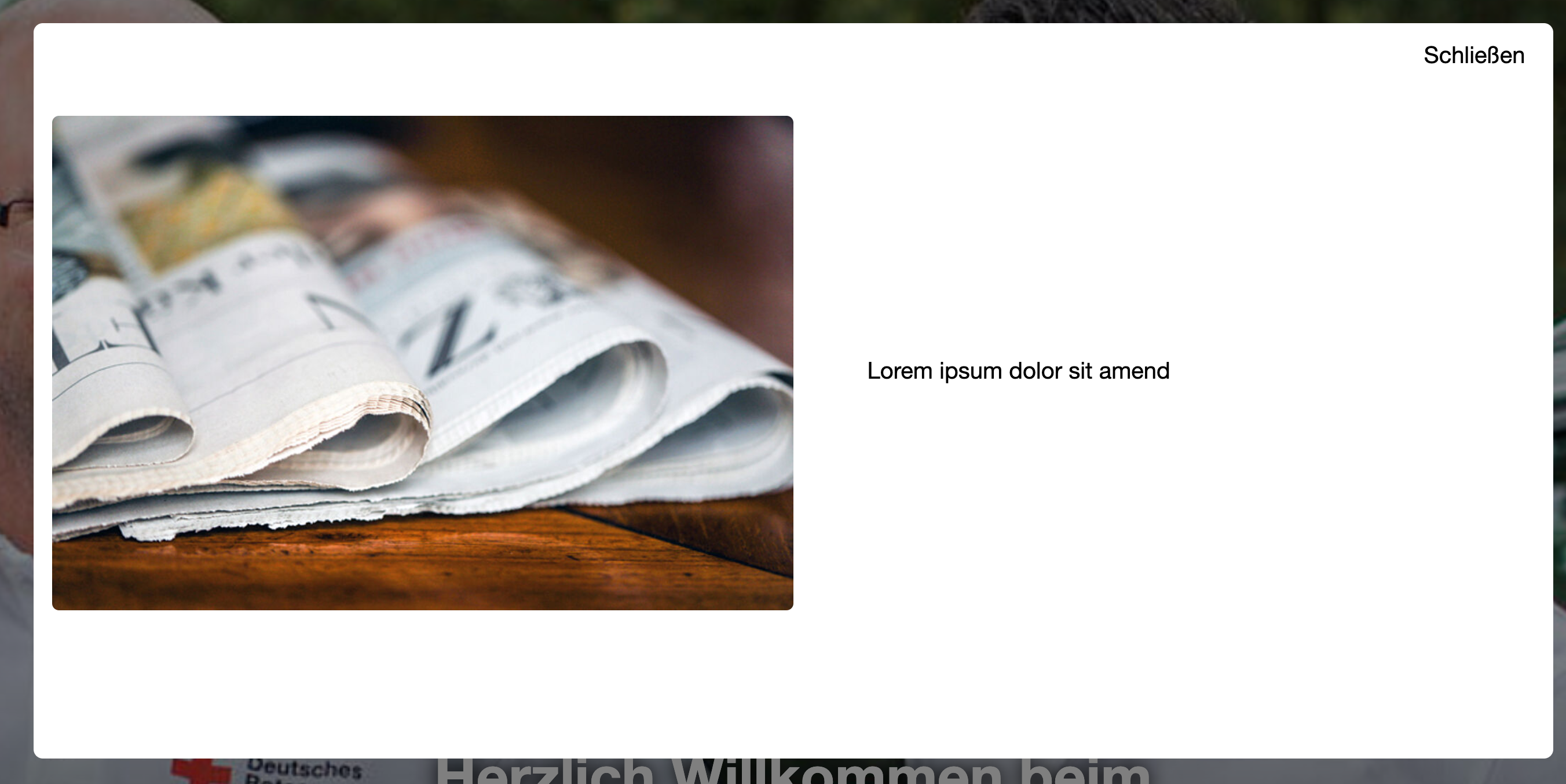
Examples
Frontend
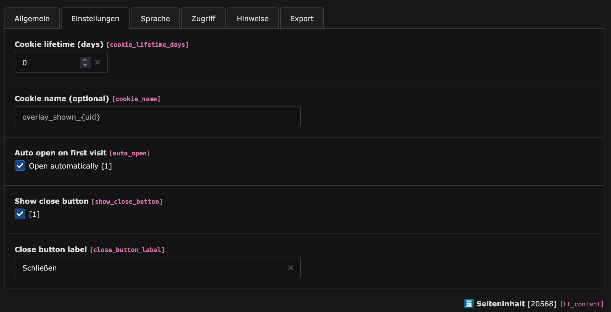
Backend
Features
- New content element: “Dialog Overlay (einmalig)” (
CType = dialog_overlay) - HTML5
<dialog>modal including optional close button - Auto‑open once per user using a cookie (configurable name and lifetime)
- Integrates with b13/container: provides one area for dialog content
- Minimal default styling; easy to override
- Static TypoScript for Fluid template registration and rendering
Installation
- Install the extension (part of this distribution) and ensure dependencies are available:
- TYPO3 Core ^12.4 or ^13
b13/container^2 or ^3
- Include the static TypoScript template in your site template:
- Template record → Includes → Add “Dialog Overlay (CE & FE Rendering)”.
- PageTS is auto‑imported by the extension (see
ext_localconf.php), so the New Content Element Wizard entry is available under the "special" group.
Usage (Editor)
- In the New Content Element Wizard, choose: Special → “Dialog Overlay (einmalig)”.
- Fill the fields:
- Titel (header): Optional title; not rendered by default but useful for backend identification.
- Einstellungen (Settings):
- Cookie‑Lebensdauer (Tage): Number of days the “already shown” cookie should live (default 30; 1–3650).
- Cookie‑Name: Optional. If empty, defaults to
overlay_shown_{uid}. - Automatisch öffnen: If checked, the dialog opens automatically on page load (default on). If unchecked, the dialog won’t auto‑open and can be opened via custom JS.
- Schließen‑Button anzeigen: If checked, renders a close button inside the dialog (default on).
- Beschriftung Schließen‑Button: Optional label (default “Schließen”).
- Dialog‑Inhalt: Add and arrange any content elements in the provided container area. They render inside the modal.
Rendering & Frontend
- Fluid template:
Resources/Private/Templates/Content/DialogOverlay.html - TypoScript setup registers the template via
tt_content.dialog_overlayandtemplateRootPaths. - The markup renders a Web Component
<fucodo-modal-once>with attributes:data-cookie-name: Cookie name. Defaults tooverlay_shown_{uid}if not set.data-cookie-days: Cookie lifetime (days). Defaults to30.data-auto-open:"1"or"0"to enable/disable auto‑open.
- Inside the component there is a native
<dialog class="dialog-overlay">element containing your content and an optional close button.
JavaScript behavior
The script Resources/Public/JavaScript/dialog-overlay.js defines the custom element fucodo-modal-once:
- On connect, it determines cookie name, days, and auto‑open mode from attributes.
- If auto‑open is enabled and the cookie isn’t set, it opens the dialog (prefers
showModal(), falls back toopenattribute). - When the
<dialog>is closed (e.g., via the close button), it writes a cookie withSameSite=LaxandSecureon HTTPS. - Uses a cookie name derived from the content element UID if no explicit name is provided.
Styling
A small default stylesheet is included via <f:asset.css>:
- Path:
EXT:dialog_overlay/Resources/Public/Webcomponents/fucodo-dialog-overlay/dist/index.css - Selectors it defines by default:
.dialog-overlay::backdrop { background: rgba(0,0,0,.5); }.dialog-overlay { border: 0; border-radius: .5rem; padding: 0; }.dialog-content { padding: 1rem; }.dialog-close-btn { display: inline-block; margin: 1rem; margin-top: .75rem; margin-right: 1.5rem; float: right; }
How to customize:
- Override with site CSS loaded after the extension’s CSS (preferred). Example:
/* increase backdrop opacity and content spacing */
.dialog-overlay::backdrop { background: rgba(0,0,0,.65); }
.dialog-content { padding: 1.5rem; }

/* constrain dialog width responsively */
.dialog-overlay { width: min(90vw, 48rem); }

/* place the close button differently */
.dialog-close-btn { float: none; margin: 0; }
- Replace the stylesheet entirely by overriding the Fluid template
DialogOverlay.htmlin your sitepackage and removing or swapping the<f:asset.css ...>line.
Accessibility notes
- Uses the native
<dialog>element witharia-modal="true". - Ensure a visible, accessible close control is present (the provided close button uses
method="dialog"). - Keep focusable elements inside the dialog and provide meaningful content. Test keyboard navigation and screen reader announcements in your target browsers.
Privacy & Cookies
- A single cookie is set on dialog close to remember that the dialog was shown.
- Attributes:
- Name: configurable (
cookie_nameoroverlay_shown_{uid}fallback) - Lifetime: configurable (days)
- Path:
/,SameSite=Lax,Securewhen on HTTPS
- Name: configurable (
- Adjust your privacy policy as needed.
Integrator reference
TCA fields (tt_content)
cookie_lifetime_days: number (default 30, range 1–3650)cookie_name: input (placeholderoverlay_shown_{uid})auto_open: check (default 1)show_close_button: check (default 1)close_button_label: input (default “Schließen”; shown only ifshow_close_buttonis enabled)
Container setup
- Uses
b13/containerwith a single area labeled “Dialog-Inhalt” atcolPos = 201. - In Fluid, children are available via
{children_201}and are rendered as provided.
Overriding templates and assets
- Templates: Add your own
templateRootPaths.20in your site package to overrideDialogOverlay.html. - JavaScript: If you need custom logic, you can deliver your own script and either:
- Override the Fluid template to load it instead of
dialog-overlay.js, or - Keep the provided component and extend it in your own script.
- Override the Fluid template to load it instead of
TypoScript
The extension delivers a static TypoScript include titled “Dialog Overlay (CE & FE Rendering)” which registers:
tt_content.dialog_overlaybased onlib.contentElementtemplateRootPaths.10 = EXT:dialog_overlay/Resources/Private/Templates/Content
Opening the dialog manually
If data-auto-open="0", you can open the dialog from custom code:
const el = document.querySelector('fucodo-modal-once');
const dlg = el?.querySelector('dialog');
if (dlg) {
  if (typeof dlg.showModal === 'function') dlg.showModal();
  else dlg.setAttribute('open', '');
}
Note: The “shown once” cookie is set when the dialog fires its close event. If you close the dialog programmatically, the cookie will also be set by the component.
Known limitations
- Native
<dialog>support varies. The component falls back to theopenattribute ifshowModal()fails, but full focus trapping may differ between browsers. Consider a ponyfill if you need broader guarantees.
Icons
- The icon identifier for the content type is
content-dialog-overlay.
Changelog
See the project’s VCS history. If you maintain a Changelog.md in your distribution, keep extension‑specific entries there.
Support
This extension is part of your site distribution. For issues, please use your project’s regular support channels or your integrator’s contact.


